Most products are designed to catch attention.
The best products are designed to work in real life.
In retail, shoppers spend five to seven seconds deciding whether to engage [1]. Online, it’s even faster. In those first moments, people scan for clarity.
Behavioral psychologists call this cognitive fluency — when something is easy to understand, it feels more trustworthy and lower risk [2]. When it’s harder to process, hesitation begins.
But the real test doesn’t happen on the shelf. It happens at home: when a supplement bottle is opened mid-morning, sheets are washed again after a long week, or a dog turns away from something the second it feels unfamiliar.
Real life moves quickly. Products not built for real-world use gradually lose trust.
Shelf appeal earns attention.
Real-world usability earns loyalty.
Why Product Usability Drives Long-Term Retail Growth
Retail growth does not come from trial alone. It comes from repetition.
When a product is intuitive, durable, and easy to understand, customers reorder it. Retailers see steady sell-through. Reviews remain stable. Returns decrease.
When friction increases, repeat purchase declines.
Bain & Company reports that increasing customer retention by just five percent can increase profits by twenty-five to ninety-five percent [3]. McKinsey research shows that companies prioritizing usability outperform those focused primarily on aesthetics [4].
For retailers and buyers, that translates to:
- More predictable reorder velocity
- Fewer customer complaints tied to confusion or readability
- Stronger shelf stability
- Higher perceived brand quality
Product design is not decoration. It is a performance variable.
This is where shelf appeal transitions into long-term loyalty.
Suggested Read: If you’re interested in how trust becomes a measurable growth driver across wellness and pet care, we explore that further in Brand Trust Is the New Growth Engine.
Our Retail Product Design Process: Testing for Real-World Usability
Designing for real life is not aesthetic preference. It is structured evaluation.
Before launch, every SKU is assessed against the same clarity and real-environment stress criteria. Not ideal lighting. Not perfect mockups. Real conditions.
We ask:
- Will this be clear in low lighting?
- Will this feel intuitive during a rushed moment?
- Will this remain legible after repeated use?
Here is how we approach real-world usability and packaging performance.
1. Clarity Before Decoration
Before textures or finishes are considered, essential information is mapped first.
As Jules Scheiber, Wholesome Goods’ Director of Brand Creative, explains:
“Clarity should come before anything becomes ‘pretty.’ All important information gets laid out first before any design elements are added.”
Hierarchy drives design — not the other way around.
For retailers, this means:
- Benefits visible at shelf distance
- Claims not buried
- Instructions immediately accessible
- Purpose understood within seconds
Jules and her team reinforce three elements that create instant trust:
- Simplicity. Avoid visual overcrowding.
- High contrast and bold color for visibility.
- Clear, legible typography. Readability is non-negotiable.
If customers cannot read it easily, it does not feel premium.
Clarity reduces cognitive load.
Reduced cognitive load builds confidence.
2. Designing for Real Use Scenarios

Every product is used in a specific way, in a specific place, by a specific person. If we misunderstand the use, the design will miss something important.
We do not design for ideal conditions. We design for real-life friction.
What customers experience at home:
- Labels that remain readable in real lighting
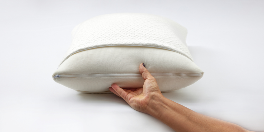
- Bedding that holds up through repeated wash cycles
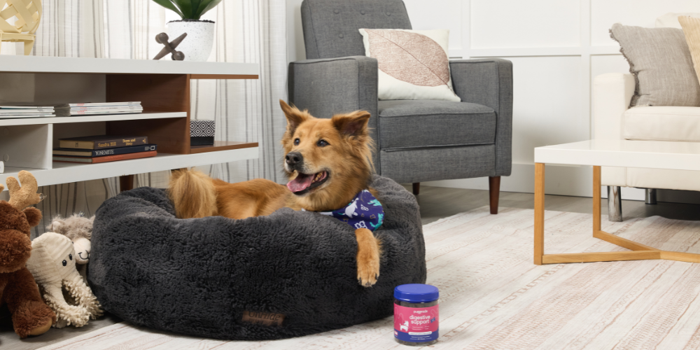
- Supplements that pets actually take — consistently
What packaging must do in real spaces:
- Fit drawers, cabinets, and nightstands without wasting space
- Feel premium without requiring extra effort
- Avoid bulky, small-space frustration
Each of these moments introduces a decision point. If something feels inconvenient, unclear, oversized, or difficult to use, hesitation follows.
Designing around real-life scenarios reduces friction.
Reduced friction builds routine.
Routine drives retention.
This is how attention becomes repetition.
3. Lighting Can Make or Break Shelf Conversion
Packaging is never viewed under perfect lighting. It is seen under bright retail aisles, warm bathroom bulbs, kitchen overheads, phone flash, and natural sunlight.
Lighting changes everything.
It determines whether colors hold their depth, small text remains readable, contrast feels strong, and key benefits stand out — or disappear.
A label that looks sharp on a screen can wash out under fluorescent store lighting. Glossy finishes can reflect glare and partially obscure claims.
For retailers and buyers, this directly impacts shelf conversion: slower decisions, reduced pickup, lower benefit comprehension.
Packaging that performs across lighting conditions improves visibility, speeds understanding, and strengthens purchase confidence — all of which support consistent sell-through.
Premium design should increase clarity, not compete with it. If packaging only looks good in a photoshoot, it will struggle in the real world.
4. Avoiding the Overdesign Trap
One of the most common packaging mistakes is information overload.
Too many badges.
Too many competing claims.
Too many visual elements fighting for attention.
When everything is emphasized, nothing stands out.
Jules explains:
“The copy is the most important element. Everything else should support it. If the design starts competing with the message, we go back and simplify, whether that means stripping down the composition or adjusting placement until the hierarchy feels clear.”
That discipline matters. When design competes with clarity, hesitation follows.
Clear hierarchy accelerates understanding.
Faster understanding builds confidence.
5. Precision Is Perception
Consistency across SKUs does more than create a clean look. It reinforces discipline.
Spacing. Typesetting. Line weight. Alignment. Color accuracy across print runs.
These details shape perception before a customer reads a single word.
“Most people wouldn’t consciously notice if a line of text was slightly out of alignment, but inconsistencies affect how polished and trustworthy a product feels. That’s why we are meticulous about spacing, line weight, and alignment.” – Jules S.
Precision is discipline made visible.
For retailers, consistent packaging strengthens brand blocking and makes product families easier to navigate.
For customers, visual cohesion reinforces reliability. When products look aligned and intentional, they feel dependable.
That consistency is not incidental. It is systemized across every product line.
Suggested Read: We explore how that operational discipline extends beyond design in Behind Every Great Product Is a Great Partnership.
6. Premium Should Feel Livable
Shelf presence matters. But premium should never feel cold or intimidating.
“We design to stand out on the shelf, but never at the expense of feeling approachable. A product should look elevated, yet still feel like it naturally belongs in someone’s home.” – Jules S.
If packaging feels sterile, overly trendy, or disconnected from daily life, it creates resistance.
In wellness, home, and pet care, design must feel elevated — yet livable.
Premium earns attention.
Approachable earns adoption.
Suggested Read: That philosophy aligns with the principles outlined in The 7 Pillars of a Modern Wellness Company.
7. Designing for the First Use (and the Hundredth)
First impressions matter.
Repetition matters more.
Most products are not used once. They are used daily, weekly, and month after month. That means performance over time is part of the design.
We design for the first use, the thirtieth use, the hundredth use — and every use after that.
Labels should not smudge after repeated handling.
Closures should not loosen, crack, or fail over time.
Materials should not warp in humid bathrooms, fade under sunlight, or lose structure in everyday spaces.
Repeated usability builds subconscious trust.
And trust compounds.
Designing for longevity is how shelf attention becomes retention.
Designing for Real People, Real Pets, Real Life
The strongest brands are built on performance customers experience every day.
That philosophy guides every brand we build across wellness, pet care, and home.
Because attention starts the conversation.
Performance sustains it.
Loyalty is what builds brands that last.
Resources:
- Nielsen Consumer Research. (2025). Product Attributes Drive Growth: The CPG Playbook for Health & Wellness Success. https://nielseniq.com/global/en/insights/analysis/2025/
- Reber, R., Schwarz, N., & Winkielman, P. (2004). Processing Fluency and Aesthetic Pleasure: Is Beauty in the Perceiver’s Processing Experience? Personality and Social Psychology Review, 8(4), 364–382. https://doi.org/10.1207/s15327957pspr0804_3
- Miah, A K M. (2023). The Value of Keeping the Right Customers. https://www.researchgate.net/publication/375277630_
- McKinsey & Company (2018). The Business Value of Design. https://www.mckinsey.com/capabilities/tech-and-ai/our-insights/